
background-clip: text とは、要素の背景をテキストの形で切り抜くCSSプロパティです。
通常、背景はボックス全体に適用されますが、このプロパティを使うと背景がテキスト部分にのみ表示されます。これにより、テキストにグラデーション・パターン・画像など、color プロパティでは実現できない表現が可能になります。
基本的な書き方
.clip-text {
  color: transparent;
  -webkit-background-clip: text;
  background-clip: text;
  background-color: currentColor; /* フォールバック */
}
ポイント
| プロパティ | 役割 |
|---|---|
color: transparent | テキスト自体を透明にして背景を見せる |
-webkit-background-clip: text | Safari・Chrome用のベンダープレフィックス |
background-clip: text | 標準プロパティ |
background-color: currentColor | 非対応ブラウザ向けフォールバック |
グラデーション文字
最も一般的な使い方は、テキストにグラデーションを適用することです。
.gradient-text {
  background-image: linear-gradient(90deg, #667eea, #764ba2);
  color: transparent;
  -webkit-background-clip: text;
  background-clip: text;
}
パターン文字の実装
background-clip: text の真価は、繰り返しパターンを適用したときに発揮されます。漫画の「トーン」のような効果や、装飾的なタイポグラフィが実現できます。
サンプル
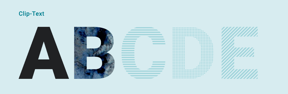
【CSS】stardust-shapehand.preview(図形とか線とか)
https://codepen.io/sarap422/embed/WNZMMpy?theme-id=25176&default-tab=result&editable=true
ストライプ(横線)
.clip-striped {
  background-image: repeating-linear-gradient(
    0deg,
    hsl(200, 80%, 50%) 0px,
    hsl(200, 80%, 50%) 4px,
    transparent 4px,
    transparent 8px
  );
  color: transparent;
  -webkit-background-clip: text;
  background-clip: text;
}
repeating-linear-gradient で4pxの線と4pxの透明を繰り返し、横縞模様を作っています。
ストライプ(斜線)
角度を変えるだけで斜めストライプになります。
.clip-striped-diagonal {
  background-image: repeating-linear-gradient(
    -45deg,
    hsl(200, 80%, 50%) 0px,
    hsl(200, 80%, 50%) 4px,
    transparent 4px,
    transparent 8px
  );
  color: transparent;
  -webkit-background-clip: text;
  background-clip: text;
}
ドット柄
radial-gradient で円形のドットパターンを作れます。
.clip-dotted {
  background-image: radial-gradient(
    circle,
    hsl(200, 80%, 50%) 40%,
    transparent 50%
  );
  background-size: 12px 12px;
  color: transparent;
  -webkit-background-clip: text;
  background-clip: text;
}
トーン(細かいドット)
漫画のスクリーントーンのような効果は、ドットを小さく・密にすることで実現できます。
.clip-toned {
  background-image: radial-gradient(
    circle,
    hsl(200, 80%, 50%) 40%,
    transparent 50%
  );
  background-size: 5.5px 5.5px;
  background-position: 2px 2px;
  color: transparent;
  -webkit-background-clip: text;
  background-clip: text;
}
background-size を小さくするほどドットが密になり、トーンのような印象になります。
画像を使った文字
背景画像をそのままテキストに適用することも可能です。
.clip-image {
  background-image: url('texture.jpg');
  background-size: cover;
  background-position: center;
  color: transparent;
  -webkit-background-clip: text;
  background-clip: text;
}
風景写真やテクスチャ画像を使うと、印象的なヒーローテキストが作れます。
実践:ユーティリティクラスとして整理
実際のプロジェクトで使いやすいように、ベースクラスとモディファイアに分離します。
/* ベースクラス */
.clip-text {
  color: transparent;
  -webkit-background-clip: text;
  background-clip: text;
  background-color: currentColor;
}

/* モディファイア:ストライプ */
.clip-striped {
  background-image: repeating-linear-gradient(
    0deg,
    var(--c-pattern, hsl(200, 80%, 50%)) 0px,
    var(--c-pattern, hsl(200, 80%, 50%)) 4px,
    transparent 4px,
    transparent 8px
  );
}

/* モディファイア:斜めストライプ */
.clip-striped.clip-diagonal {
  background-image: repeating-linear-gradient(
    -45deg,
    var(--c-pattern, hsl(200, 80%, 50%)) 0px,
    var(--c-pattern, hsl(200, 80%, 50%)) 4px,
    transparent 4px,
    transparent 8px
  );
}

/* モディファイア:ドット */
.clip-dotted {
  background-image: radial-gradient(
    circle,
    var(--c-pattern, hsl(200, 80%, 50%)) 40%,
    transparent 50%
  );
  background-size: 12px 12px;
}

/* モディファイア:トーン */
.clip-toned {
  background-image: radial-gradient(
    circle,
    var(--c-pattern, hsl(200, 80%, 50%)) 40%,
    transparent 50%
  );
  background-size: 5.5px 5.5px;
}
使用例
<h1 class="clip-text clip-striped">ストライプ文字</h1>
<h1 class="clip-text clip-striped clip-diagonal">斜めストライプ</h1>
<h1 class="clip-text clip-dotted">ドット文字</h1>
<h1 class="clip-text clip-toned">トーン文字</h1>
CSS変数 --c-pattern を使うことで、色の変更も柔軟に行えます。
<h1 class="clip-text clip-dotted" style="--c-pattern: hsl(340, 80%, 50%);">
  ピンクドット
</h1>
応用:ホバーで色が変わるリンク
background-clip: text とグラデーションスライドを組み合わせると、ホバー時に左から右へ色が変わるアニメーションが実現できます。
サンプル

【CSS】stardust-shapehand.preview(図形とか線とか)
https://codepen.io/sarap422/embed/WNZMMpy?theme-id=25176&default-tab=result&editable=true
.link-animated {
  display: inline;
  background-image: linear-gradient(
    to right,
    hsl(240, 73%, 46%) 0%,
    hsl(240, 73%, 46%) 50%,
    currentColor 50%,
    currentColor 100%
  );
  background-size: 200% 100%;
  background-position: 100% 0;
  -webkit-background-clip: text;
  background-clip: text;
  -webkit-text-fill-color: transparent;
  transition: background-position 0.4s ease;
}

.link-animated:hover {
  background-position: 0 0;
}
仕組み
- 200%幅のグラデーションを作成(左半分がリンク色、右半分が通常色)
- 初期状態では右端を表示(通常色)
- ホバーで左端にスライド(リンク色に変化)
color のトランジションでは実現できない「方向性のあるアニメーション」が可能になります。
ブラウザ対応
background-clip: text は主要ブラウザで広くサポートされていますが、一部注意点があります。
| ブラウザ | 対応状況 |
|---|---|
| Chrome | ✅ -webkit- プレフィックス推奨 |
| Safari | ✅ -webkit- プレフィックス必須 |
| Firefox | ✅ 標準プロパティで対応 |
| Edge | ✅ -webkit- プレフィックス推奨 |
フォールバック
非対応ブラウザや古い環境向けに、background-color: currentColor をフォールバックとして設定しておくと、最低限テキストが見える状態を保てます。
.clip-text {
  background-color: currentColor; /* フォールバック */
  color: transparent;
  -webkit-background-clip: text;
  background-clip: text;
}
まとめ
background-clip: text を使うと:
- グラデーション文字
- ストライプ・ドット・トーンなどのパターン文字
- 画像を使った装飾文字
- 方向性のあるホバーアニメーション
といった、color プロパティだけでは不可能な表現が実現できます。
特に大きな見出しやヒーローセクションで使うと、視覚的なインパクトを与えられます。ユーティリティクラスとして整理しておけば、さまざまなプロジェクトで再利用しやすくなるでしょう。

